Slow React apps can kill user experience. More often than not, it’s the image assets in the app that cause the slowdown. Optimizing images can give a big boost to the performance of any application. In this post, we’ll walk through a complete image optimization strategy and bring LCP down from ~8s to ~1s.
If you want to watch this blog in a video format, you can follow along above.
The starting point of the code for this app is found on GitHub here.
Step 0: Find the bottleneck images
Before changing anything, we need to know what we’re working with. Let’s find the images that are causing the most slowdown. Here’s how to find them:
- Open Chrome DevTools,
- navigate to the Network tab,
- and throttle to Slow 4G with cache disabled.
Throttling is important because it simulates real user conditions. Most users are not using the fastest internet possible.
To find the slowest images, look for:
- LCP image: the largest visible element on initial load, usually a hero image
- File size: how much data is being transferred
- Load time: how long the image takes to fully render
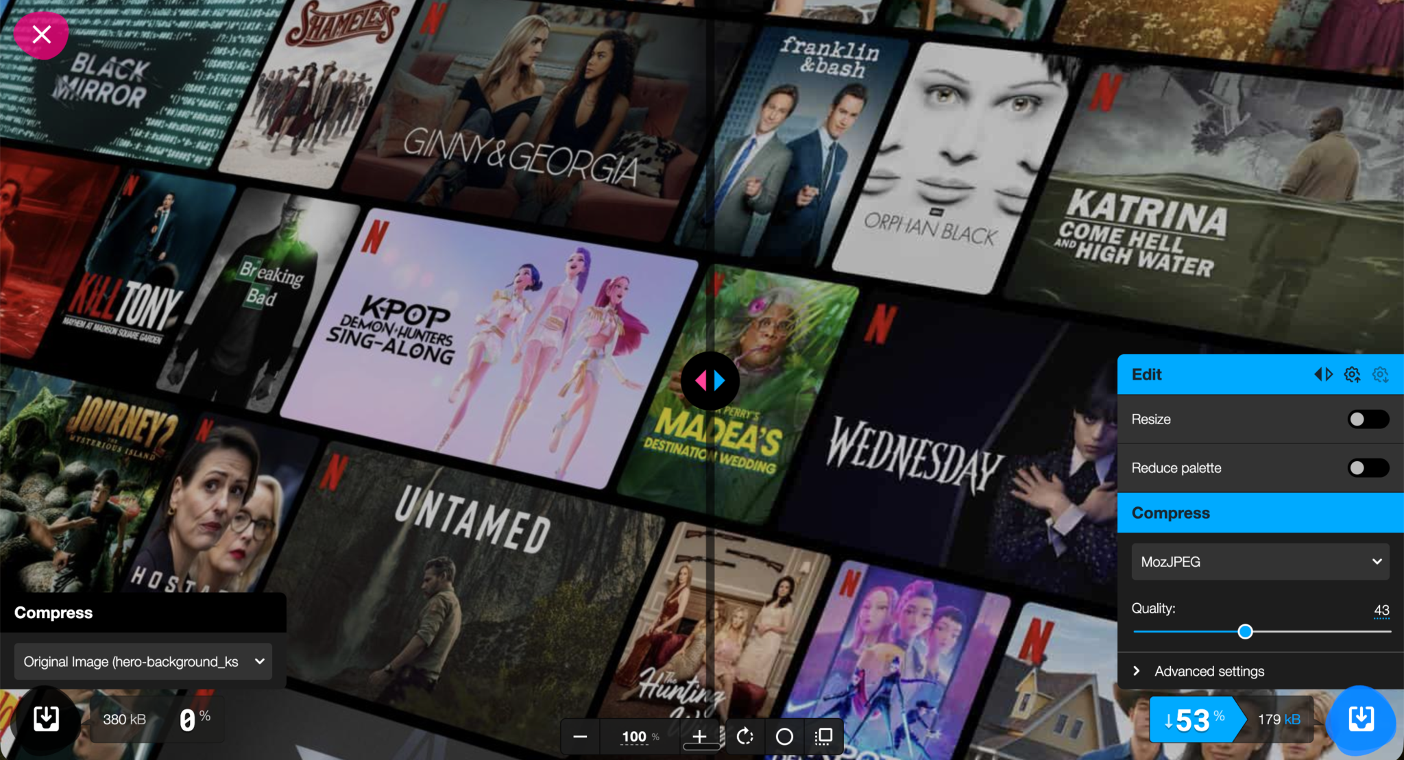
In our example app, the hero background image is a locally bundled JPEG at 380 KB. That’s our starting point:
We are starting off with an LCP of 8.18s.
Step 1: Image compression
The first and quickest fix is to compress image sizes. It requires no infrastructure changes, no configuration, and no code. Using the right tools, you can cut image sizes in half without any noticeable loss in quality.
Some tools for image compression:
- Squoosh: A browser-based tool with a live side-by-side preview and adjustable compression settings. Best for one-off images or when you want fine-grained control.
- ImageOptim: A desktop app that strips metadata and compresses images with minimal quality loss.
- TinyPNG: A simple drag-and-drop web tool that works well for PNGs and JPEGs.
- CLI tools: ideal for batch compression as part of your build process.
imageoptim-cliimageminImageMagick
Result
Compressing the hero image from 380 KB to 180 KB produced a noticeably smaller bundle with zero perceptible difference in visual quality:
Step 2: Move images to a CDN
Serving images directly from your app bundle is one of the most common performance mistakes in React apps. When an image is bundled locally, every user downloads it from the same origin server, regardless of where they are in the world, therefore having images as part of the local bundle is an antipattern.
A Content Delivery Network (CDN) solves this by:
Uploading images to the CDN
A popular CDN for image delivery is Cloudinary. It offers a generous free tier and powerful URL-based image transformation API on the fly. It is perfect for our use case. To upload an image in Cloudinary:
- Create a free Cloudinary account
- Upload your image via the Cloudinary dashboard or CLI
- Copy the generated CDN URL
- Replace your local image reference in your React component:
Result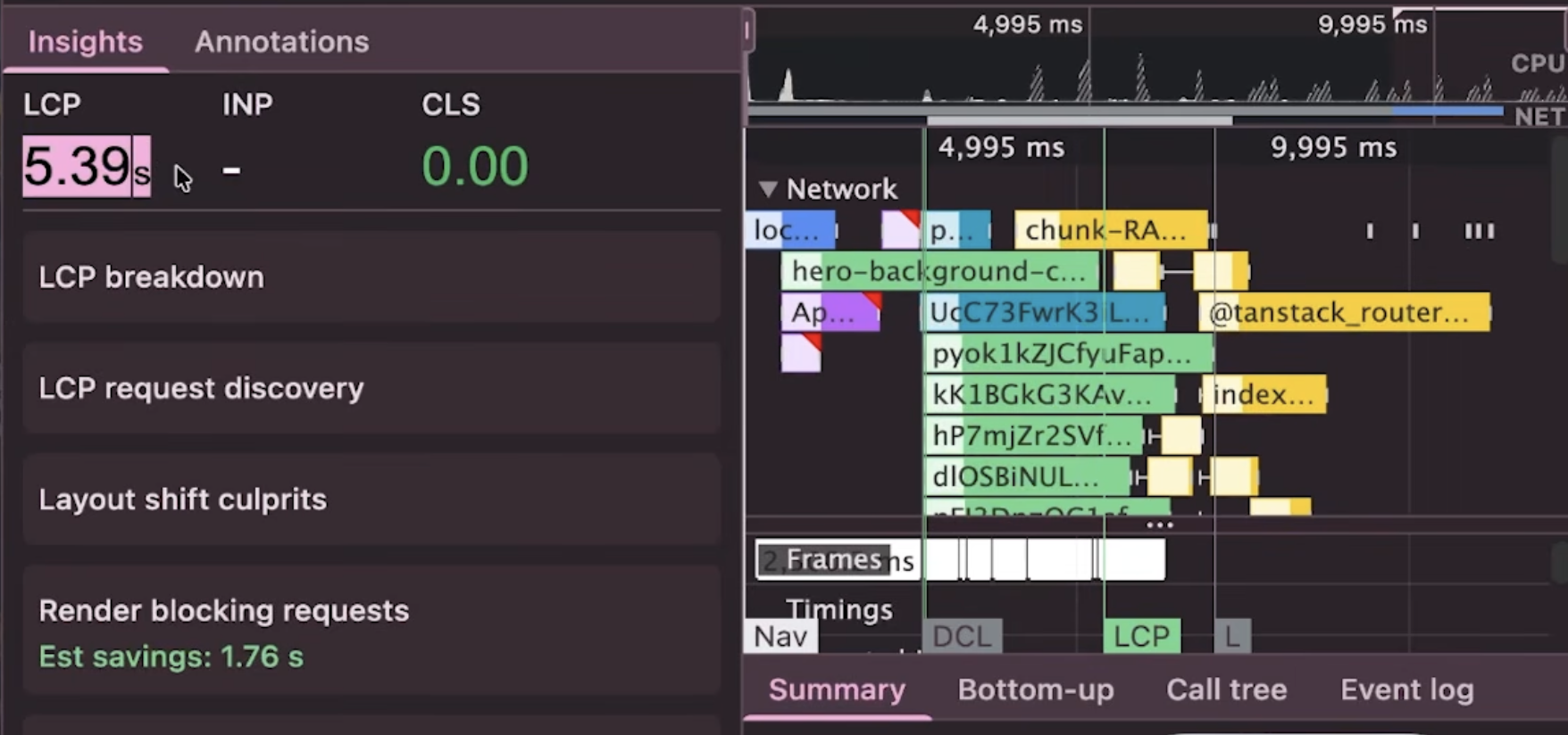
After moving to Cloudinary, LCP reduced from 8.8s → 5.39s.
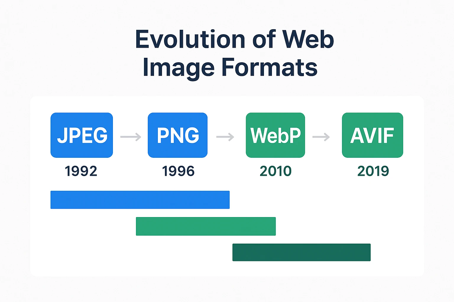
Step 3: Using modern image formats
Image formats like JPEG and PNG are not designed for the modern web. Newer formats like WebP and AVIF offer significantly better compression at the same visual quality:
Here is a table that talks about the different image formats available today and which are preferred for which use case:
| Type | File format | MIME Type | Usage |
|---|---|---|---|
| AVIF | AV1 Image File Format (.avif) | image/avif | 1. Offers much better compression than PNG or JPEG.
2. Good choice for images and animated images. 3. Check browser support before using. |
| WEBP | Web Picture format (.webp) | image/webp | 1. Slightly less as good as compared to AVIF but still offers great compression than PNG or JPEG.
2. Excellent choice for both images and animated images. 3. Well supported in all browsers. |
| JPEG | Joint Photographic Expert Group image (.jpeg, .jpg) | image/jpeg | 1. Lossy compression.
2. Works well for still images. |
| PNG | Portable Network Graphics (.png) | image/png | 1. More precise compression of source images. Works better than JPEG.
2. Preferred choice when using transparent images. |
| SVG | Scalable Vector Graphics (.svg) | image/svg+xml | 1. Vector image format.
2. Preferred for elements such as icons, diagrams, etc., that must be scaled accurately at different sizes. |
Source:
In short, avif and webp image formats offer superior compression as compared to jpeg and png. While AVIF offers better compression as compared to WebP, it is supported in the latest version of all major browsers. WebP has a broader browser support currently.
Converting to modern formats
1. Switching on the fly using CDNs such as Cloudinary
One of Cloudinary’s most useful features is on-the-fly format conversion via URL parameters. You can switch formats without re-uploading the image:
// Original JPEG


// Convert to WebP — just change the extension


// Convert to AVIF
Even better, use f_auto to let Cloudinary automatically serve the best format the browser supports:
// f_auto picks WebP, AVIF, or JPEG depending on the browser
You can chain it with q_auto for automatic quality optimization too:
// Best format + optimal quality — the most common production setup
This means a Chrome user gets AVIF, a Safari user gets WebP, and an older browser gets the original JPEG, all from a single URL, zero extra code.
2. Using command-line tools
For anything beyond a few images, build pipelines, CI, scripted workflows and CLI tools are the right approach. The most useful ones are cwebp / avifenc — the reference encoders for WebP and AVIF respectively. Installed via Homebrew, they give you direct codec control:
# Convert to WebP at quality 80
cwebp -q 80 hero.png -o hero.webp

# Convert to AVIF
avifenc --min 20 --max 40 hero.png hero.avif
sharp-cli: Node-based, built on libvips. Fast, actively maintained, good for batch processing:
npm i -g sharp-cli

# Convert a folder of images to WebP
sharp -i ./images/*.jpg -o ./dist/ --webp-quality 80
Result
Switching from JPEG to WebP dropped our LCP from 5.39s → 2.87s: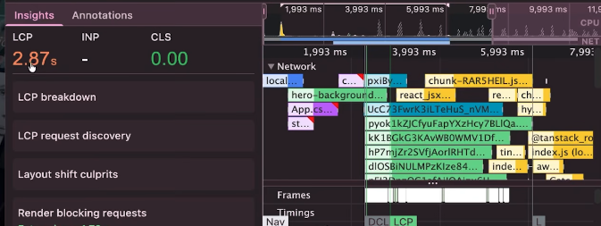
Step 4: Optimizing quality and size for the user’s viewport
Users view apps on different devices. It’s important to deliver appropriate image sizes and quality based on the user’s device. For example, a user viewing media on a retina display will need a higher quality image as opposed to a user viewing the same media on a standard-resolution display. This is because retina displays have a higher pixel density (typically 2x the standard), which means they require images with twice the resolution to appear sharp and crisp. Serving the same low-resolution image to all devices results in blurry or pixelated visuals on high-DPI screens:
- Responsive images: HTML
<picture>element allows developers to conditionally serve optimized images based on the device’s screen resolution and viewport size, all natively in the browser with no JavaScript required. - Quality settings: With tools like Cloudinary, we can choose the optimal quality level for each image. This can be useful when you are displaying images that need to be displayed in a smaller format, such as thumbnails, or a blurred preview. The
q_autoparameter analyzes the image content and selects a quality setting that balances file size and visual fidelity. It has four sub-variants –q_auto:best,q_auto:good(the default),q_auto:eco, andq_auto:low, each targeting a different point on the quality/file-size tradeoff.
Combining these two techniques, we can use the <picture> element along with q_auto to provide an optimal quality image appropriate to the user’s viewport:
<picture>
  {/* Small screens — phones under 640px */}
  <source
    media="(max-width: 640px)"
    srcSet="
  />

  {/* Medium screens — tablets up to 1024px */}
  <source
    media="(max-width: 1024px)"
    srcSet="
  />

  {/* Large screens — desktops and above */}
  <source
    media="(min-width: 1920px)"
    srcSet="
  />

  {/* Fallback img — always required */}
  <img
    src="
    alt="Hero background"
  />
</picture>
The browser evaluates each <source> element in order and uses the first one whose media condition matches. If none match, or if the browser doesn’t support <picture>, it falls back to the <img> tag — which is why the fallback <img> is always required.
Result
Responsive images ensure mobile users download a fraction of the data compared to desktop. Combined with the previous steps, our LCP improved to 2.33s: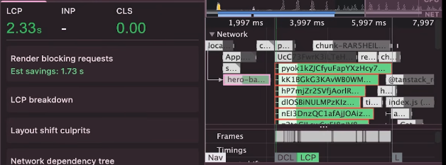
Step 5: Set loading priorities
Not all images are made the same. Some images need to be shown to the user right away, such as the hero image, and some can be lazy loaded until the user has actually scrolled down to the page. Therefore, it is necessary to set the priority of images accordingly.
Prioritize the LCP image
We are going to set the fetchPriority of the our LCP image: the hero banner. In order to set the fetchPriority with a <picture> element, we can use a two step process:
1. Set the fetchPriority of the default img –
<img
  src="
  alt="Hero background"
  fetchpriority="high"
/>
2. Preload image asset for the most common viewport size so the browser starts fetching the image before it even parses your component tree:
<head>
  <link
    rel="preload"
    as="image"
    href="
  />
</head>
Lazy load everything else
For images below the fold, defer loading until the user scrolls near them:
<img
  src="
  alt="Video thumbnail"
  loading="lazy"
/>
Result
Setting fetchpriority="high" and preloading the hero image gave us a small but meaningful improvement, bringing LCP to 2.30s on first load: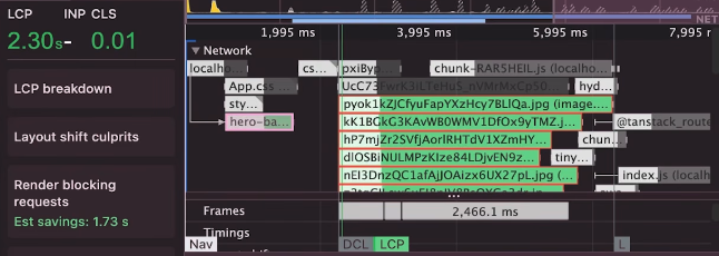
Step 6: Enable caching
Everything we’ve done so far speeds up the first visit. Caching speeds up every visit after that.
When a CDN serves an image, it can attach cache headers that tell the browser to store the image locally. On repeat visits, the browser serves the image from its local cache instead of making a network request at all.
Cloudinary automatically sets Cache-Control headers on its responses. For maximum caching, configure a long max-age:
Cache-Control: public, max-age=31536000, immutable
A max-age of 31536000 caches the image for one year. This is safe to do because Cloudinary URLs include version identifiers, so if you update an image, the URL changes, and users always get the latest version.
You can also configure cache headers in your own server or edge config if you’re self-hosting:
// Express.js example
app.use('/images', express.static('public/images', {
  maxAge: '1y',
  immutable: true,
}));
Result
With caching enabled, repeat visitors loaded the hero image instantly from their local cache, dropping LCP to 1.22s!: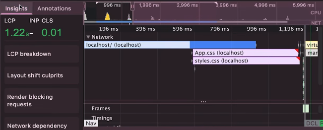
Summary
Here’s how each optimization step performed:
| Step | Action | LCP |
|---|---|---|
| Baseline | Local 380 KB JPEG | 8.8s |
| Step 1 | Image compression | ~7s |
| Step 2 | Move to CDN | 5.39s |
| Step 3 | Convert to webp / avif formats | 2.88s |
| Step 4 | Add q_auto quality optimization and responsive images with <picture> |
2.33s |
| Step 5 | Preload + fetchpriority="high" |
2.30s |
| Step 6 | CDN caching enabled | 1.22s |
Images are often the single largest contributor to slow React app load times, and they’re also one of the easiest things to fix. With the steps given in this blog post, you can incrementally optimize your images, focusing on the LCP image first, and observe an improvement in the performance.
🚀 Sign up for The Replay newsletter
The Replay is a weekly newsletter for dev and engineering leaders.
Delivered once a week, it’s your curated guide to the most important conversations around frontend dev, emerging AI tools, and the state of modern software.
Get set up with LogRocket’s modern React error tracking in minutes:
-
Visit to get
an app ID -
Install LogRocket via npm or script tag.
LogRocket.init()must be called client-side, not
server-side$ npm i --save logrocket // Code: import LogRocket from 'logrocket'; LogRocket.init('app/id');// Add to your HTML: <script src=" <script>window.LogRocket && window.LogRocket.init('app/id');</script> - (Optional) Install plugins for deeper integrations with your stack:
- Redux middleware
- NgRx middleware
- Vuex plugin
Get started now
PakarPBN
A Private Blog Network (PBN) is a collection of websites that are controlled by a single individual or organization and used primarily to build backlinks to a “money site” in order to influence its ranking in search engines such as Google. The core idea behind a PBN is based on the importance of backlinks in Google’s ranking algorithm. Since Google views backlinks as signals of authority and trust, some website owners attempt to artificially create these signals through a controlled network of sites.
In a typical PBN setup, the owner acquires expired or aged domains that already have existing authority, backlinks, and history. These domains are rebuilt with new content and hosted separately, often using different IP addresses, hosting providers, themes, and ownership details to make them appear unrelated. Within the content published on these sites, links are strategically placed that point to the main website the owner wants to rank higher. By doing this, the owner attempts to pass link equity (also known as “link juice”) from the PBN sites to the target website.
The purpose of a PBN is to give the impression that the target website is naturally earning links from multiple independent sources. If done effectively, this can temporarily improve keyword rankings, increase organic visibility, and drive more traffic from search results.